Tuesday, 25 January 2011

Main Task- Final finished magazine.


Front cover:
I decided to change my image due to feedback. I have now made it more focused and then used more of my images to create variation. I have stuck to my colour scheme of red, black and white. I also did some more font research and found a larger range that I thought would suit my magazine. I have included typical conventions such as a bar code, pricing and issue number to make it realistic. I kept the bubble shaped boxes around some of the text to make it more appealing to my target audience yet did get rid of it on the bottom to make it look more sophisticated yet still keep the light hearted, easy reading feel about it.

Contents page:
I didn't make many changes to this as i was initially happy with it. I had to change the black and white picture due to it being on my front cover. I kept the colour scheme the same and decided that i did not need to change the text as i was happy with the layout of this.


Double page spread:
For this I felt the image with more detail would be more fitting as it is quite complex and not clear at first glance. I used a white/silver typeface on the bottom to keep with the colour scheme and to also add more diversity of typeface's within the magazine as before it all looked quite samey. I used a fade effect on the right hand side where the text because I felt a block colour was too 'in your face' and did not look as professional. I used the same heading typeface's as I did on my front cover to keep a running theme throughout and then used a simple typeface 'Calibri' for the text. This is because it looks sophisticated and is easy to read. I also found from my research this is mostly the style they use.

Main Task- Feedback

After recieving more feedback from my class I decided to make a few small changes to my front cover, contents page and double page spread. I then sent the improved versions to my friends to get some more feedback and see what else needed to be changed as I did not feel 100% confident with my work. Here is some of the feedback I found very useful:


'I think it looks really good J I like the front cover because its not too busy and you can see the pictures clearly and I really like the way you set out the contents page, I think it looks professional and the image used on the double page spread is really effective. J '

'The photography looks sophisticated and chic. I think the title font on the front cover and the title of the contents, looking scruffy relates to the young target audience well.  The style of the contents, having the writing down one side and the pictures down the other, is simple yet affective. The colour scheme of the whole magazine is bold, therefore it captures the eye of the potential buyer. The picture on the double page spread looks less professional but is very inventive. The separate images of the girl have not been cut out perfectly so this makes the image as a whole less effective. The magazine as a whole is consistent throughout and is mostly made to high standard.'

Thursday, 6 January 2011

Main Task- Completed contents page

Main Task- Double page spread with model.


This is my double page spread with my model. I had some problems with the angle so I had to rotate it. Unfortunately, you can slightly see the editing on the image but over all it has come out as I intended it. I will get some feedback soon and consider making some changes, though some suggestions are impossible so I will not be able to make them.

Main Task- Photo manipulation


I have decided to use this image for my double page spread. As you can see, I have made the cropping neater in the bottom one and changed the colouring of not only her lips and eyes but her whole self. This will lighten up the page slightly more. I have also removed the shadowing from under her nose so it looks more professional and natural.


For the contents page image I have simply cropped it down, lightened it and made it black and white. This is so I have a larger range of images and I think it looks more professional and gives my contents page focus.

Main Task- Double page spread and contents page picture's- before editing.


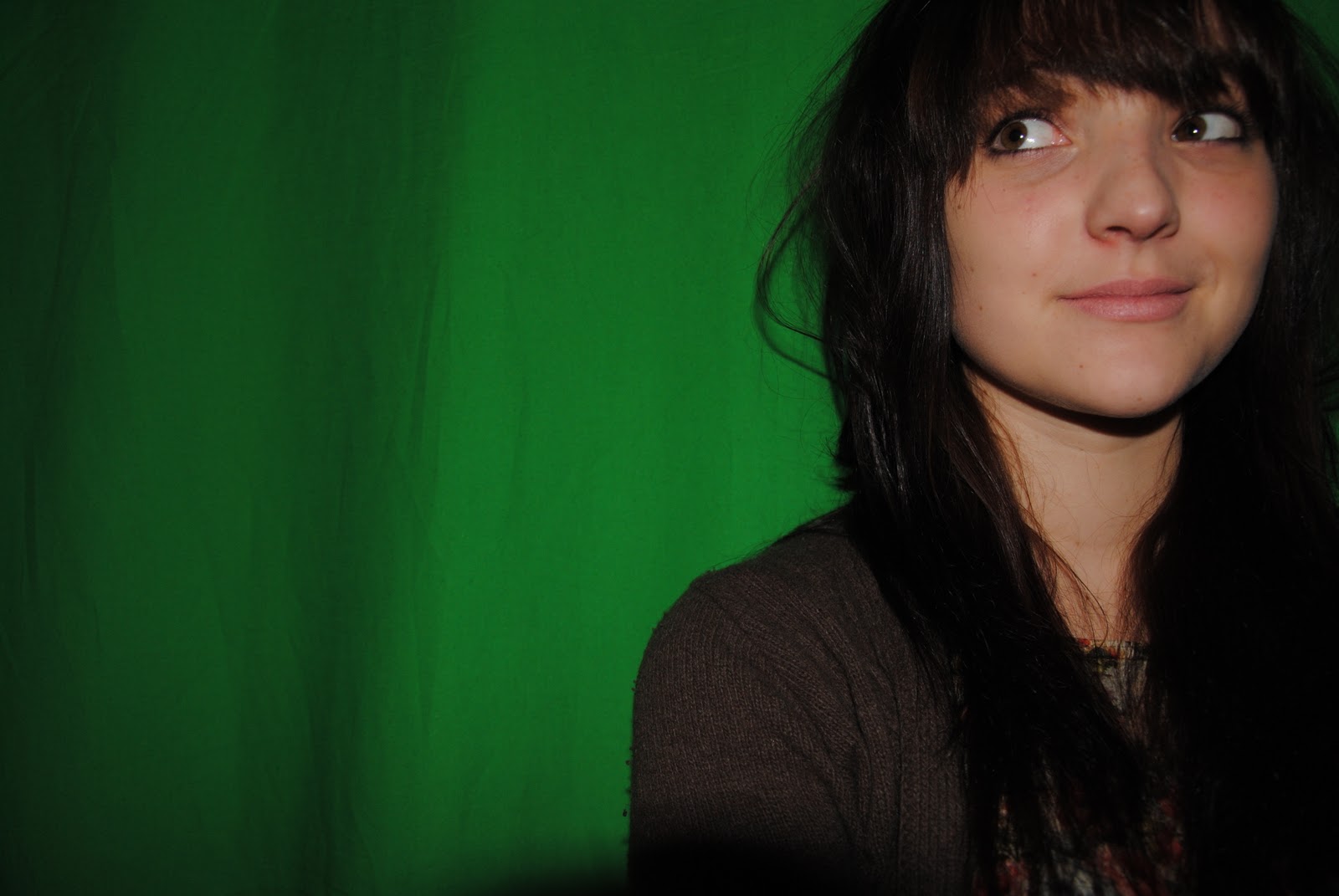
We took a large range of picture's but I have narrowed it down to these one's. I really like the one's where she has darker clothing on but due to having black text that tends to overlap on my double page spread I don't think this will work. I may have to consider changing my layout slightly so it fits better yet still looks professional.

Tuesday, 4 January 2011

Main Task - First drafts.

I have done the first drafts of both my contents page and double page spread. They are both how I planned them to be the only problem is I haven't managed to take pictures for them both yet so on my contents page all I need to do is add in the picture of my model into the top box. Here is the draft so far:


For the double page spread I have used an image of Kate Nash to place for my model till I have taken the photo's. Luckily, the image is very similar to how I want my model to look so it should not be too hard to replace it.


When I do take my image the whole back ground will be the same colour so it will not look like it is not meant to over flow onto the image. Also some of it has been cut off but this is simply because it is in print preview.