Thursday, 28 April 2011
Tuesday, 29 March 2011
Websites used
http://www.facebook.com/
-Used to carry out my questionnaires.
http://www.blogger.com/
-Used to record my coursework.
http://www.nme.com/
-For research, looking at similar magazine's.
http://www.undertheradarmag.com/advertise/
-To research into institutions in America.
http://www.youtube.com/
-Gathering video's and researching the different type of artists I would incorporate.
http://en.wikipedia.org/wiki/Kerrang!
-Getting information on other genre's of magazine.
http://en.wikipedia.org/wiki/Top_of_the_Pops_(magazine)
-Once again information of other magazine's that would be competing with mine.
http://www.flickr.com/photos/adamjacksonphotography/
-Friend who gave me inspiration for my photographs
Tuesday, 22 March 2011
Who would be the audience for your media product?

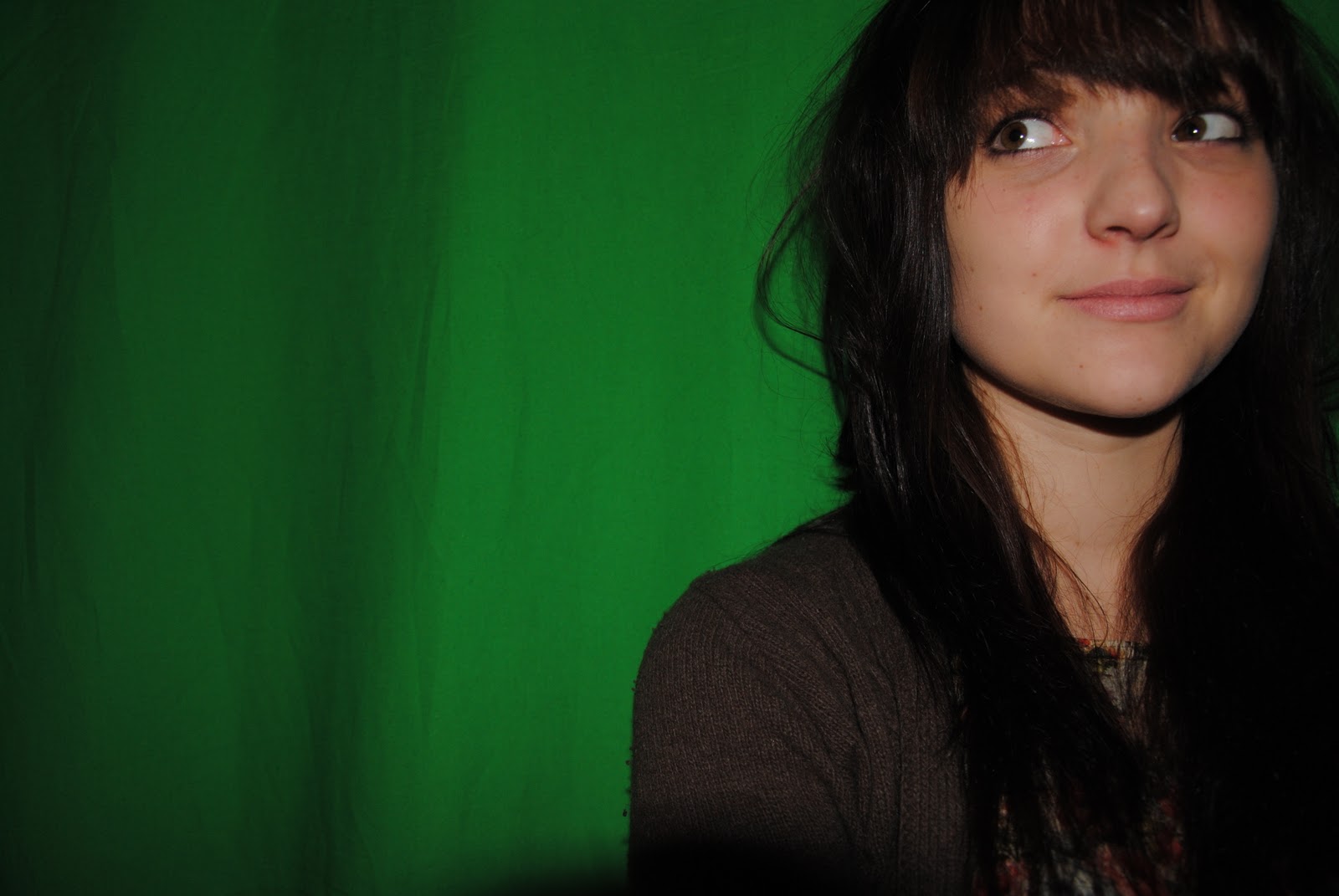
Alexa Chung.
My target audience would look very similar to Alexa in her style of clothing and the fact she is at a music festival. She is also around the age my magazine is targeted at.
My magazine represents quite a large range of people yet it is aimed at are people with quite a specific music interest into 'Indie' and Acoustic music. The magazine has a common theme of this genre and even the model has quite a particular look to portray this. My target audience is people aged around 13 - 25. Though this is quite a small group of the population, these are the people that read magazine's most and have quite specific interest's therefore would be quite likely to purchase it. Also for my research I only asked people of this age as I felt it would be easiest for myself to make a magazine that I would be able to relate too and due to most of my friends being this age I was able to get a lot of good and reliable responses. I had asked my family about music magazines before hand and found none of them read music magazines and this therefore would not of been ideal. When making my magazine I was mostly influenced by magazine's such as NME and Under the Radar. They both used mostly Indie artists and had quite a similar target audience's- they are also both very successful which would help my magazine sell well as it is fresh and new yet still has similarities with current products out there. My reader profile was very similar to that of both of these magazines and this also helped with choosing the age range of my target audience and the aspects I would include.
In what ways does your media product use, develop or challenge forms and conventions of real media products?


How does your media product represent particular social groups?
My magazine is mainly targeted at mostly female's and therefore I have chosen to represent women through my product. I have chosen a female model and decided to only have medium shots of her, this is because I wanted people to focus on her features and for those to catch her eye. I also thought a medium close up would be most suited because people can not judge her or get idea's about body weight and be influenced for example with some magazines they will only have models under a certain size and I do not agree with this so I am therefore representing women and their rights through this. My target audience are also quite young and I chose quite a young model so it is easily to relate to. She has a relaxed posture and is smiling, she is also not dressed up in expensive clothing or trying to look sophisticated therefore relating to a large range of people. Teenagers would be able to relate to her look and also the things she says in the interview can be related too by a large range of people as they are centred quite a bit around love and this is something every social group and age experiences in their life time.
What kind of media instiution might distribute your media product and why?
Whilst making my music magazine I had a lot of influence from the magazine Under The Radar which is distributed in North America by Rider Circulation Services. Unfortunately my magazine is targeted at a British audience and therefore this would not be ideal if it were to be sold. I also studied NME quite a lot and decided that IPC media would distribute my magazine. Both of these magazine's were very similar to my magazine; they both target around the same age range of 17+ and have very 'Indie' focused aspects to them. Due to IPC already distributing a 'Indie' style magazine which has been very successful, it shows they would have experience with this and also that they would know exactly how to market the magazine and make links with the two to create a bigger success. NME also have very similar artists to my magazine Acoustic Unplugged and have done featured articles on The Arctic Monkeys, Blur etc showing how similar the two magazine's are in the music industry.IPC Media also currently only distribute one music magazine whilst they have at least 3 TV guide magazine's. This shows that they are able to have more than one magazine successfully distributed at the same time and they could possibly take on another music magazine though they are focused on the same genre of music, all TV magazine's have the same content and therefore this would not effect either magazine or the success.
How did you attract/address your audience?
I decided to use my model as the main attraction to my magazine. By using a large image in the center and then smaller one's it catches your eye and ultimately attracts you to it. I had not seen this on any other magazine covers before and therefore I think it adds individuality and makes it quite unique. Also by using a dark background I enabled the model to stand out more and by photoshopping some of her features such as making her eyes brighter it makes it stand out more through contrasting the other factors on the page. Along with this I decided to use red in my colour scheme so it stands out well and once again catches your eye- this was also helped by the other two colours in my scheme, black and white. I used green on the background of the smaller images because I felt it added more colour to my front cover yet this is not something I kept throughout the magazine as I felt the black, white and red looked effective on my contents page and double page spread alone. It is also easy to read against the background so you can automatically see what you will be reading and know if you are interested. By using direct eye contact it makes the audience feel they have a relationship with the model and this will attract them to know more. I used quite innocent looking pictures yet chose to have my model with her hair done and her make up more dominant than in my preliminary. I did this so it attracts a male audience due to her attractiveness, it can attract any age group and the image is appropriate and also due to her being quite a natural and real life model size it would attract a female audience and also not put any pressure on them about weight or looks as it is not that type of magazine. It is about music and not beauty. I decided to use a lot of the same style artists, I feel this adds continuity through out and enables people to know what they are going to be reading.
What have you learnt about technologies from the process of constructing this product?
Through my coursework I have learnt many skills. Before doing this I did not know much about photoshop and how many different things you could do with it. For my editing practise, I changed the background colour to black and white and carried this through to my main task when editing the main image. I also learnt how to crop several pictures into one effectively and though it did take a lot of time and practise I thought it went quite well. I learnt how to do this and came up with the idea through a friends photography work which has been incorporated in my blog earlier on. For my front cover I used a green screen which I had never done before so that was another thing I had learnt about. I put my pictures on to the computer and then through photoshop once again I changed the background colour. I did not know how to create a double page spread on Microsoft Publisher before this task and this is another skill I have learnt.I also found that getting certain colours to work well against another was hard and how to over come this by simply having a slightly translucent background to it hence the bubble shapes on my front cover. I also developed more complex skills with Microsoft Word which I have not used much before for design, I found it quite hard trying to layout my work as it kept moving unexpectedly but I over come this by changing the settings on the images and they therefore did not move as much as before. I struggled when trying to get my fonts stand out enough against my background and therefore have made a lot of changes through out. Choosing the images was also quite difficult as due to the image being the main attraction of current magazines, it had to be eye catching and different. I found that by varying camera angles and the distance in which you take your image your magazine catches more attention. It was quite hard to get a range of different photographs as I only had two opportunities where my model was available yet I did use a professional camera and this was another thing I had not done so I learnt about the different ways they work. I have also never used a blog before doing this coursework therefore I have learnt about the way they work and they ways in which you can change a lot of aspects of them.
Looking back at your preliminary task, what do you feel you have learnt in the progression from it to the full product?
From my preliminary task I have learnt that being able to set things out well on one page is quite hard, in my preliminary task I tried to minimise the amount of text on the cover due to it looking cluttered though whilst doing my main task I realised it was due to the size of my image and colour of my background. If your colouring is too dark or you have a very complex image it makes it harder to add text on to it and that is the reason I added in the bubble shapes in my main task as my image was still too dark yet I did not want to alter it too much. I found out that the type face is quite an important factor, if you do not vary it or use different sizes within your work then it often looks too similar and quite plain. You need to use a wide range to get people's attention. You also need to have more than 2 sizes on font, in my preliminary I did not use many different sizes and therefore it did not look as effective as I wanted it too. I did not realise why this was until doing more thorough research into music magazine's and seeing the variation. Also without a tag line under the mast head, your front page often looks quite plain and it does not have quite so much of an edge or individuality. A tag line is often something that influences someones choice in magazine and gives an insight into the magazine itself. I did not include one on my preliminary and once again through research I learnt how important they are and what type of tag line I should include.
Tuesday, 25 January 2011
Main Task- Final finished magazine.


Front cover:
I decided to change my image due to feedback. I have now made it more focused and then used more of my images to create variation. I have stuck to my colour scheme of red, black and white. I also did some more font research and found a larger range that I thought would suit my magazine. I have included typical conventions such as a bar code, pricing and issue number to make it realistic. I kept the bubble shaped boxes around some of the text to make it more appealing to my target audience yet did get rid of it on the bottom to make it look more sophisticated yet still keep the light hearted, easy reading feel about it.
Contents page:
I didn't make many changes to this as i was initially happy with it. I had to change the black and white picture due to it being on my front cover. I kept the colour scheme the same and decided that i did not need to change the text as i was happy with the layout of this.
For this I felt the image with more detail would be more fitting as it is quite complex and not clear at first glance. I used a white/silver typeface on the bottom to keep with the colour scheme and to also add more diversity of typeface's within the magazine as before it all looked quite samey. I used a fade effect on the right hand side where the text because I felt a block colour was too 'in your face' and did not look as professional. I used the same heading typeface's as I did on my front cover to keep a running theme throughout and then used a simple typeface 'Calibri' for the text. This is because it looks sophisticated and is easy to read. I also found from my research this is mostly the style they use.
Main Task- Feedback
After recieving more feedback from my class I decided to make a few small changes to my front cover, contents page and double page spread. I then sent the improved versions to my friends to get some more feedback and see what else needed to be changed as I did not feel 100% confident with my work. Here is some of the feedback I found very useful:
'I think it looks really good J I like the front cover because its not too busy and you can see the pictures clearly and I really like the way you set out the contents page, I think it looks professional and the image used on the double page spread is really effective. J '
'The photography looks sophisticated and chic. I think the title font on the front cover and the title of the contents, looking scruffy relates to the young target audience well. The style of the contents, having the writing down one side and the pictures down the other, is simple yet affective. The colour scheme of the whole magazine is bold, therefore it captures the eye of the potential buyer. The picture on the double page spread looks less professional but is very inventive. The separate images of the girl have not been cut out perfectly so this makes the image as a whole less effective. The magazine as a whole is consistent throughout and is mostly made to high standard.'
Thursday, 6 January 2011

Main Task- Double page spread with model.

This is my double page spread with my model. I had some problems with the angle so I had to rotate it. Unfortunately, you can slightly see the editing on the image but over all it has come out as I intended it. I will get some feedback soon and consider making some changes, though some suggestions are impossible so I will not be able to make them.
Main Task- Photo manipulation


I have decided to use this image for my double page spread. As you can see, I have made the cropping neater in the bottom one and changed the colouring of not only her lips and eyes but her whole self. This will lighten up the page slightly more. I have also removed the shadowing from under her nose so it looks more professional and natural.


For the contents page image I have simply cropped it down, lightened it and made it black and white. This is so I have a larger range of images and I think it looks more professional and gives my contents page focus.
Main Task- Double page spread and contents page picture's- before editing.


We took a large range of picture's but I have narrowed it down to these one's. I really like the one's where she has darker clothing on but due to having black text that tends to overlap on my double page spread I don't think this will work. I may have to consider changing my layout slightly so it fits better yet still looks professional.
Tuesday, 4 January 2011
Main Task - First drafts.
I have done the first drafts of both my contents page and double page spread. They are both how I planned them to be the only problem is I haven't managed to take pictures for them both yet so on my contents page all I need to do is add in the picture of my model into the top box. Here is the draft so far:


For the double page spread I have used an image of Kate Nash to place for my model till I have taken the photo's. Luckily, the image is very similar to how I want my model to look so it should not be too hard to replace it.

When I do take my image the whole back ground will be the same colour so it will not look like it is not meant to over flow onto the image. Also some of it has been cut off but this is simply because it is in print preview.
Main Task - Double page spread text.
Hey Brooke, it's been so long. How have you been?
Hey guys! Oh I’ve been great thanks just so busy all the time these days, it’s hard to get a break!
Your album has been out for a while now and there appears to be a common theme. What inspired you to write songs
surrounding love so much?
I’ve had a pretty tough year with relationships. I’ve had one of the toughest break-ups I’ve ever had and finally I’m starting to be happy again. I just though it was the best idea to write about something that means a lot to me.
I’ve had a pretty tough year with relationships. I’ve had one of the toughest break-ups I’ve ever had and finally I’m starting to be happy again. I just though it was the best idea to write about something that means a lot to me.
We've heard here at AU that you're doing some "secret" smaller gigs, is this true?
Yes there will but they are exclusive invite only and VIP tickets, sorry guys!
So will you be performing some of your songs that have been recorded in Radio 1's Live Lounge or just your original one's because you've had a lot of interest in those as well?
I'll be recording some live lounge one's though it will mostly be my own songs. I don't want to get credit for other people's amazing music but because some of the songs have gone so well, I just have to play them. It's all about pleasing your fans at the end of the day.
And when's the tour starting?
18th April! I'm so excited!
18th April! I'm so excited!
Why did you choose to start in Brighton?
Brighton has always been good to me and it's where I’m from. I've always said if I went on tour it's where I’d start and the people there are always so friendly and such a good crowd. It's just home.
Brighton has always been good to me and it's where I’m from. I've always said if I went on tour it's where I’d start and the people there are always so friendly and such a good crowd. It's just home.
Are you sure it's not anything to do with your new love interest, Rupert Grint?No comment. These are sudden rumours,he's a lovely lad, that's all I'll say. Now AU, be professional... you cheeky things.
Okay, okay, we'll keep it strictly to music! You've had the largest number of downloadswith your newest song 'It's enough'. How did it feel when you found out?It felt amazing. That song just means so much to me as I wrote it when I was in quite a tough place with my last boyfriend. To know it's come to number 1 so fast, well it's all I could of wanted.
And you're up for an award too! Fastest rising star of the year...
I know I can't believe it! When I heard I ran around the room screaming. There have been so many good people coming into the music business lately though so.. who knows
Well, it's been a pleasure having you Brooke!
It's been a pleasure to be here.
Editorial feedback:
Editorial feedback:
It’s easy to read, doesn’t make you loose interest half way through. It’s not full on formal language so it catches attention and keeps it. There’s good information about times of gigs and other information on her music. Also some gossipy news which is good to interest other people who don’t want to read just all about music.
Not really sure on what type of music she does just by the interview, but from the magazine I would, so I guess it doesn’t matter.
Subscribe to:
Posts (Atom)